ISTC
Website Redesign
My role: UX design, Usability Testing, Usability Analysis
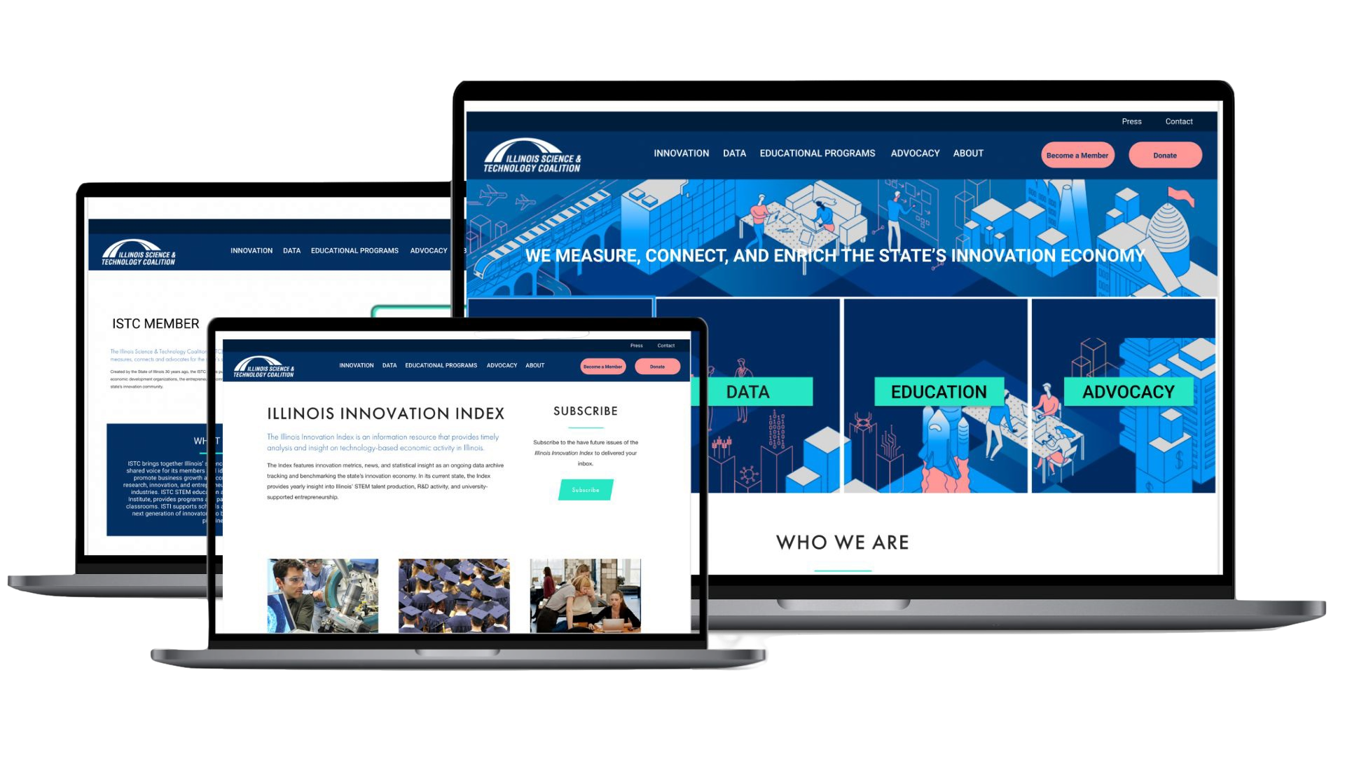
Web redesign of Illinois Science & Technology Coalition's
navigation and information architecture/hierarchy.
About ISTC
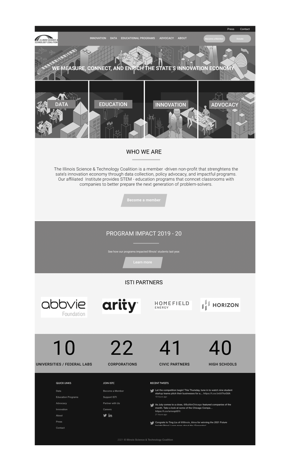
ISTC supports the state's innovation economy through innovation, data, education, and advocacy/policy. Started 30 years ago by the state of Illinois, they pair Fortune 1000 companies with startups that address their corporate/tech needs. ISTC provides mentorship opportunities for young STEM learners and heavily focuses on DEI.
Project Overview
This is a 3-week concept project, and there are 3 UX designers in the group. We collaborated on most of the project. The methods used in the project are Comparative analysis, Usability testing, Card sorting, Tree testing, Persona development, Design Studio, User flow, Site map development, Sketching, Wireframing, and Prototyping.
I took the lead on comparative analysis, usability testing, card sorting, tree testing, persona development, and wireframing.
The Problem
ISTC is currently going through a rebranding, the website is convoluted and busy, and they would like it to be clean and simple. How might we reshape the site to match the rebrand and make it easier to navigate, with a cleaner look and feel?
Design Journey
Usability Testing
Usability Analysis
Persona
Ideation&Design
Usability Testing
We conducted usability testing to gain a deeper understanding of the problem and gather insights. We assigned users 4 tasks and asked them questions about navigation, their observations, comprehension of the website's purpose, and their overall impressions.
Our UX team closely observed and documented the actions, user flows, and opinions of the 5 participants.
Tasks
Make a donation
Find the STEM challenge
Become a member
Find the corporate-startup
Key Findings
Majority of users couldn’t understand the gist of what the ISTC does, the purpose.
Users expected to see the application form when clicked on the “Become a Member” button on the Home Page.
Users had difficulties with the “Become a Member” and “Support ISTC” options, couldn't find them.
Users noted that the navigation was “vague”.
What does the user want?
What does the user want?
To ascertain user preferences for the navigation structure, we conducted card sorting, tree testing and heuristic evaluation.
Card Sorting
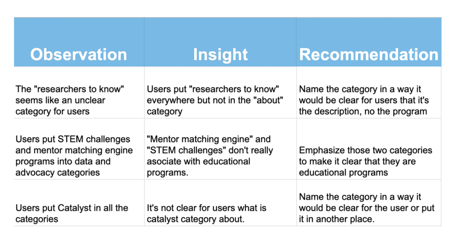
Following the Usability Test, our team proceeded with a Card Sorting Test. In this study, participants organized concepts or information presented on cards into coherent categories that align with their own mental models.
The number of participants: 7
Tree Testing
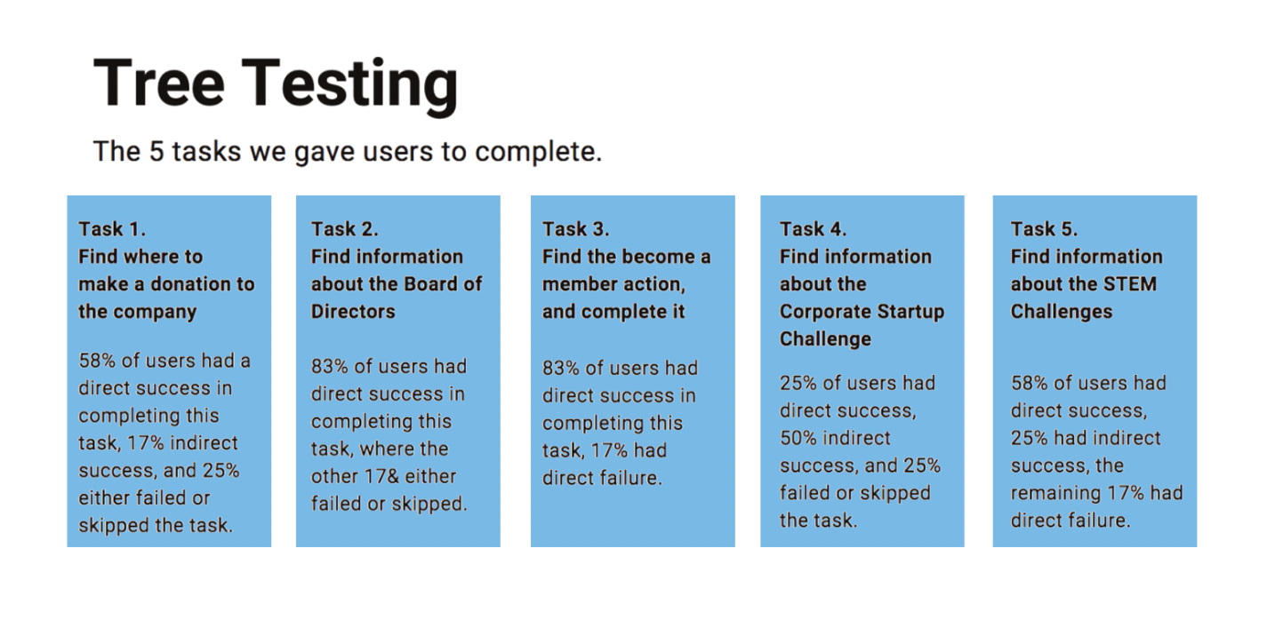
Following the Card Sorting exercise, we sought to obtain a more comprehensive evaluation of the website's effectiveness and its navigation hierarchy. This step was crucial to improve how content is organized on the site professionally.
The number of participants: 12
The number of tasks: 5
Heuristic Evaluation
We've gathered extensive feedback on the existing navigation, prompting our next move to assess the website's usability and user interface. Subsequently, we conducted a severity evaluation, rating violations on a scale of 1 to 5, with 5 representing the highest severity.
User Personas
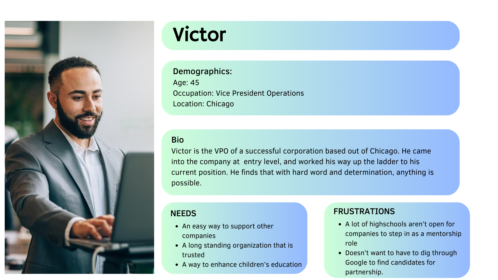
After gathering sufficient information from the research, we came with two User Personas that represent the ISTC target audience and that help us focus on specific user needs.
Ideation & Design
Based on the research data, we brainstormed the potential changes for the redesign.
Click here to see more of the annotated wireframes.
Home page
Moved four content boxes with IDEA to the front of the Home Page.
Moved the “About” category to the main navigation bar.
“Become a Member” is a Call-To-Action button on the main navigation bar.
Changed “Support ISTC” to the “Donate” Call-To-Action button.
Dropdown menu
Added the dropdown menus under each category and placed all the subcategories into the dropdown menus.
Become a Member Main Page
Added the additional page for the “Become a Member” button and added the application form for users to submit (instead of sending a blank email).
What does the user think?
What does the user think?
Usability testing II
In the second iteration of our usability testing, we tested the redesigned website. Participants were assigned four specific tasks regarding the navigation, notable observations, comprehension of the website's purpose, and the value it offers. Subsequently, our UX team observed and documented user interactions, flows, and feedback.
The number of participants: 4
Click here to see the usability test 2 insight.
Tasks
Find more information about the STEM (science, technology, education & math) challenge.
Find the data index.
Become a member.
Donate to the organization.
Key Findings
Users understand the website’s purpose
Users can find the information they need quickly without any confusion
Users accomplish tasks quickly
“The website provides a lot of information, and it is clear what ISTC does. The navigation bar is easy to use and it’s possible to learn all the information.”
Ideation & Design II
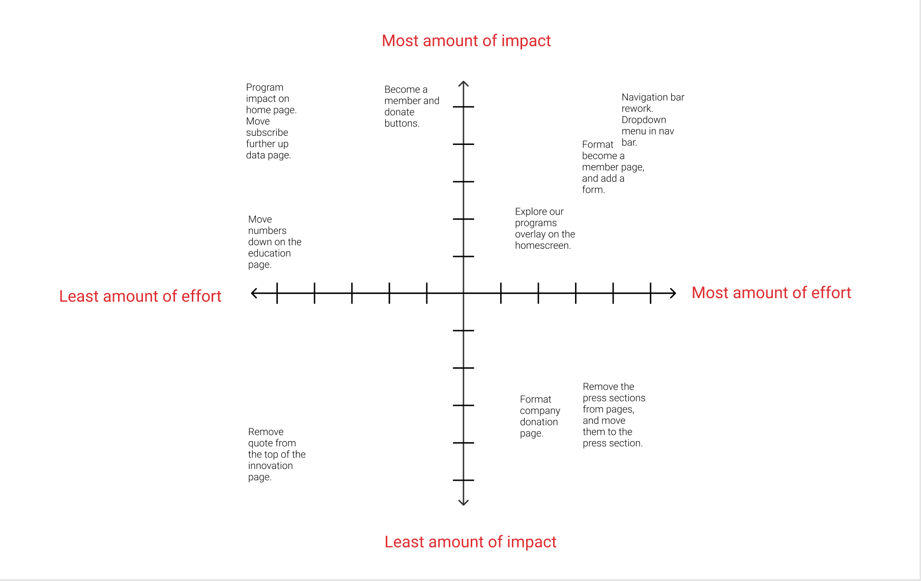
Based on the usability test insight, we brainstormed the potential changes for the redesign.
home page
data index page
STEM challenges page
data home page
education programs page
company donation page
advocacy page
data press page
innovation page
become a member page
Click here to see more about the High-fidelity mockups and High-Fidelity prototypes.
Usability testing III
For our last and final usability test, we tested the High-Fidelity version of the prototype. Users were given 4 tasks to accomplish, and they were asked some questions regarding navigation, if anything stood out to them, if they understood the idea of the website and what it offers. Next, the UX team observed and took notes of the user flows, actions, and opinions.
Click here to see the usability test 3 insight.
Tasks
Find more information about the STEM (science, technology, education & math) challenge.
Find the data index.
Become a member.
Donate to the organization.
Key findings
Users liked the Call-To-Action buttons.
Users find the navigation clear and easy.
All users accomplished the tasks quickly..
Click here to see our happy path video walkthrough from the persona's perspective.
What's next for ISTC
Throughout our 3 week sprint, we researched several different websites, including the ISTC site.
We conducted usability tests on the current rendition of the ISTC site.
Finally, we made a rendition of our own. Here is a list of what we believe will be the most effective way to move forward with a better outcome on the navigation scheme and some information hierarchy.
Thank you for your time!
